HTML, HTTP, Cloud
- Press O or Escape for overview mode.
- Visit this link for a nice printable version
- Press the copy icon on the upper right of code blocks to copy the code
Today's topics
- HTML
- HTTP
- Cloud hosting
- CSS
HTML
Making a webpage
Let's write and publish a webpage from scratch!
HTML is semantic!
Non-semantic tags were deprecated! 🤢
<b> <i> <font>
New semantic tags were added! 😍
          <header> <nav> <article>
          <section> <main> <footer>
HTML doesn't need plugins!
Who needs YouTube when you have...
          <audio src="o_tannenbaum.ogg" controls="true" preload="true">
          </audio>
          <video src="bunny_trailer.webm" controls width="390">
          </video>
HTTP
Loading a webpage: Part 1
First, the domain is resolved over DNS:

Ways to check DNS status:
ping cs.berkeley.edu
dig cs.berkeley.edu
Loading a webpage: Part 2
The browser requests the webpage over HTTP:

The server responds over HTTP with the HTML:

HTTP tools
curlcommand- Browser network tab
- Postman
- Wireshark
Cloud computing
Cloud hosting providers
- Amazon Web Services
- Google Cloud
- Azure
- Heroku
- ...
Google App Engine
Let's explore it...
Example: Khan Academy
Khan Academy Architecture
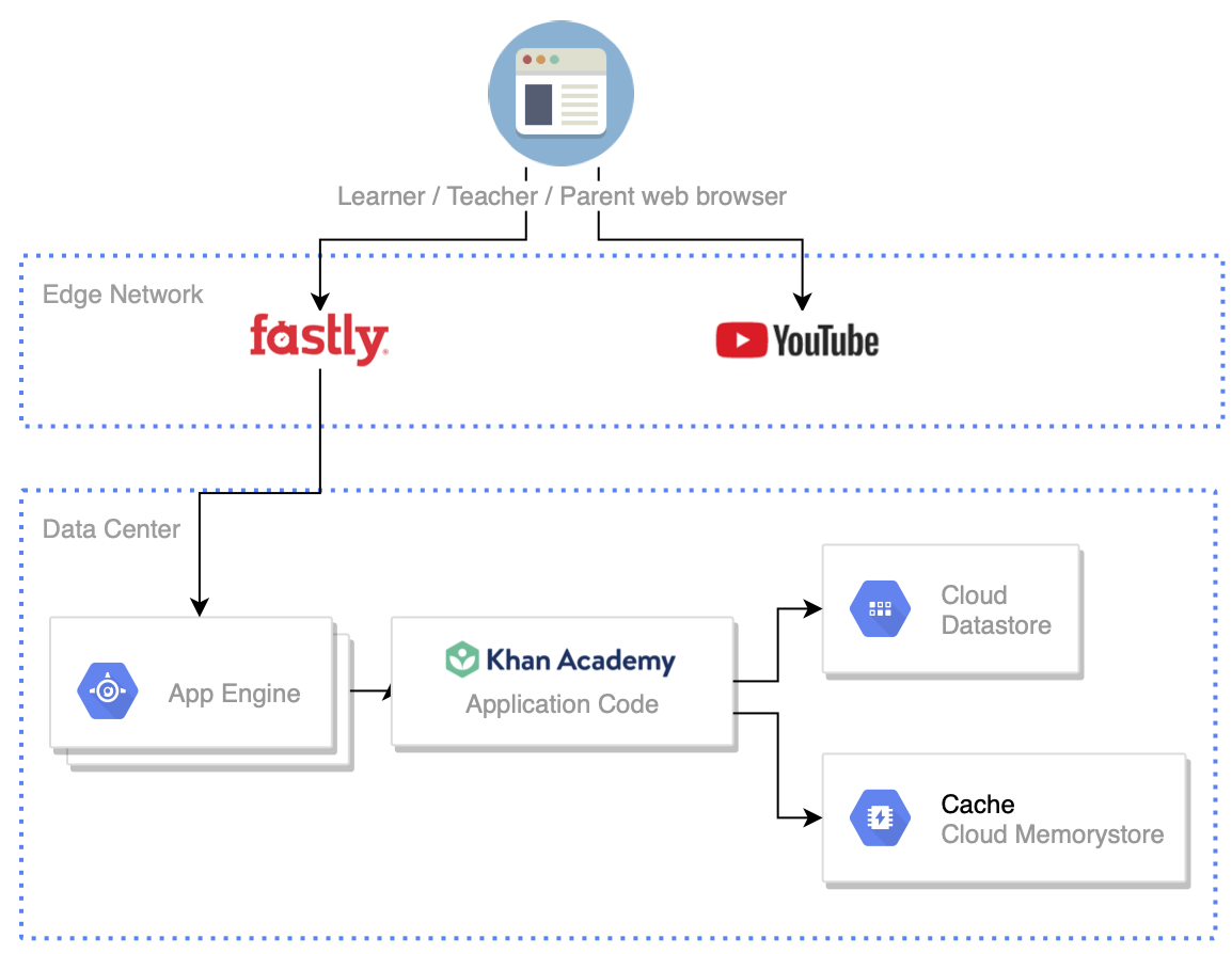
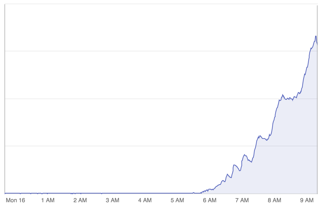
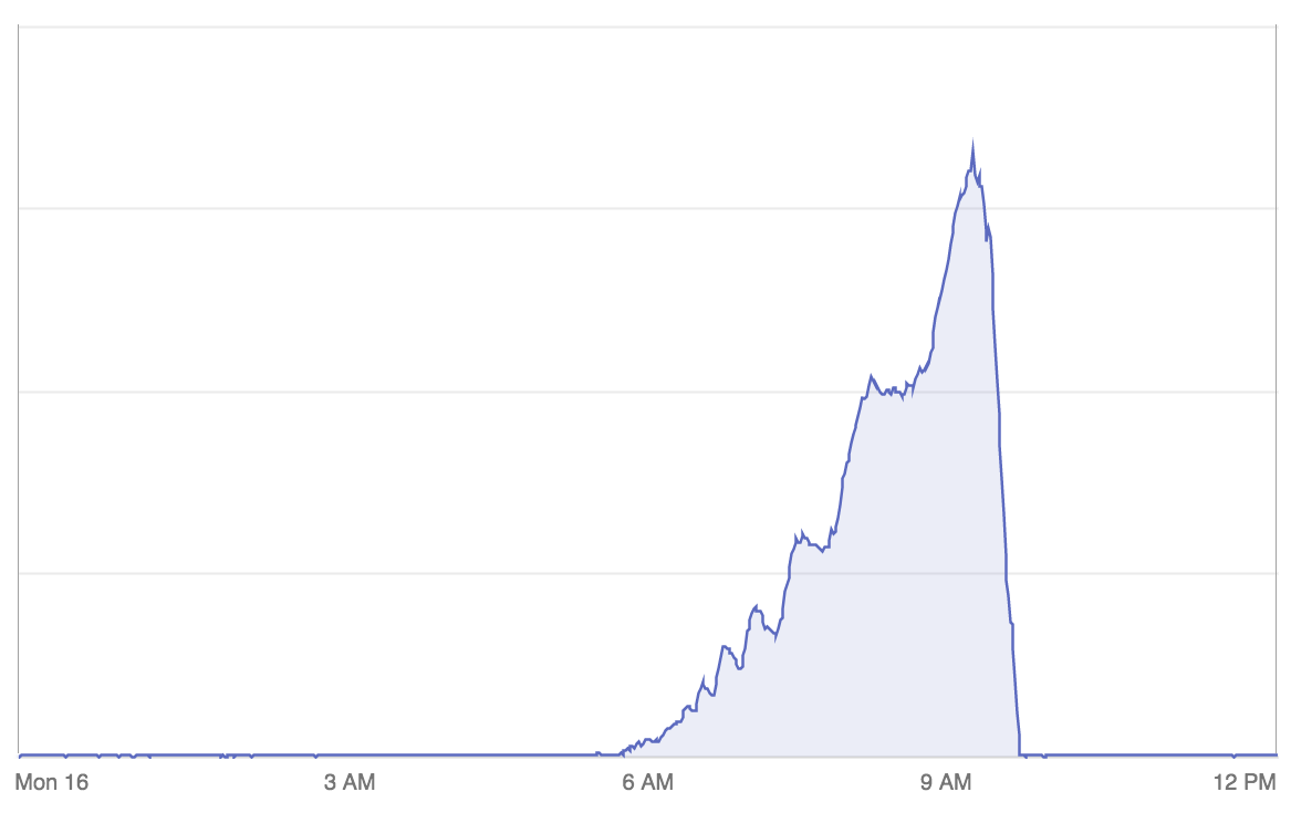
Blog post: How Khan Academy Successfully Handled 2.5x Traffic in a Week
Cloud = Scalability!
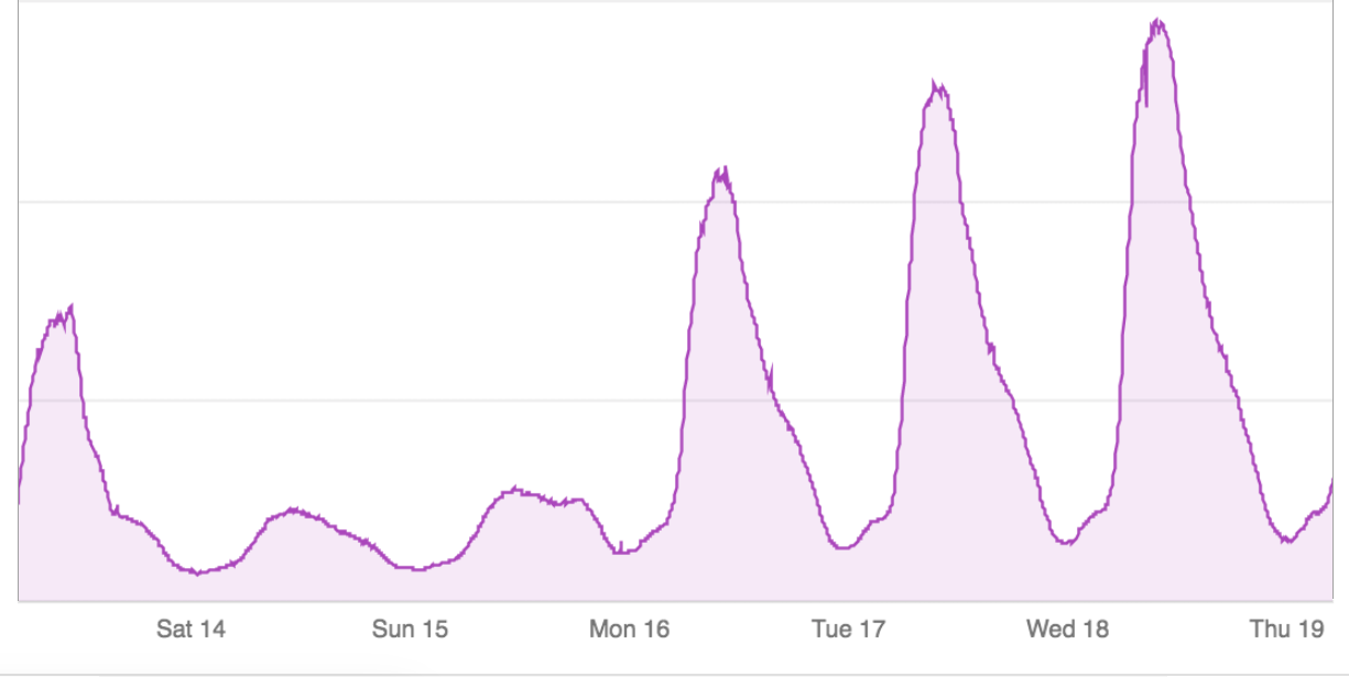
Scalability++
Service-oriented architecture

CSS Effects
Rounded corners
Opacity
background: rgba(0, 0, 0, 0.5);
caniuse.com: rgba colors
Hue/saturation/luminance color
caniuse.com: hsla colors
Gradients
More reading: MDN: linear-gradient
Shadows
box-shadow: rgba(0, 0, 128, 0.25) 0px 0px 0px;
caniuse.com: shadows
filter

Web fonts
      @font-face {
        font-family: 'LeagueGothicRegular';
        src: url('fonts/leaguegothic/leaguegothic-webfont.eot');
      }
      .special-header {
        font-family: 'LeagueGothicRegular', sans-serif;
      }
Finding fonts:
CSS Animations
Keyframes
Use CSS3 @keyframes to define a custom CSS3 animation. Example:
        @keyframes pulse {

          from {
           opacity: 0.0;
           font-size: 100%;
          }

          to {
           opacity: 1.0;
           font-size: 200%;
          }

}Apply a CSS Animation
Apply the CSS animation you defined to a specific HTML element.
<div>Pulse!</div>
      div {
        animation-name: pulse;
        animation-duration: 2s;
        animation-iteration-count: infinite;
        animation-timing-function: ease-in;
        animation-direction: alternate;
      }
Multi-Step Animations
      @keyframes rainbow {
          0%   {
            background-color: red;
            width:500px;
          }
          25%  {
            background-color: yellow;
            width: 200px;
          }
          50%  {
            background-color: blue;
            width: 300px
          }
          100% {
            background-color: green;
            width: 200px;
          }
      }


      div {
        animation-name: rainbow;
        animation-duration: 6s;
        animation-iteration-count: infinite;
        animation-timing-function: ease-in;
        animation-direction: alternate;
      }
Transitions
  #box.left {
    margin-left: 0;
  }

  #box.right {
    margin-left: 1000px;
  }
- Click =>
document.getElementById('box').className = 'left'; - Click =>
document.getElementById('box').className = 'right';
    #box {
    transition: margin-left 1s ease-in-out;
  }
- Click =>
document.getElementById('box').className = 'left'; - Click =>
document.getElementById('box').className = 'right';
caniuse.com: css-transitions
Animation Examples
- Doctor Who - Spinning Tardis from 2012 CSS3 talk
- CSS3 Submarine
- Star Wars: The Force Awakens
- 3D Solar System
See the Pen Submarine with CSS by Alberto Jerez (@ajerez) on CodePen.
CSS Layout
CSS Flexbox
          .staff-gallery  {
            display: flex;
            flex-wrap: wrap;
          }

          .staff-gallery div {
            height: 150px;
            flex-grow: 1;
          }

Pamela Fox (she/her)

Michael Ball (he/him)

Rajavi Mishra (she/her)

Samson Petrosyan (he/him)

Gurpreet Kaur Khalsa

Jimmy Xu (he/him)

Abhinav Dhulipala (he/him)

Amritansh Saraf

Angela Jiang (she/her)

Michael (Mike) Chou (he/him)
CSS Grid
          .grid-gallery {
            display: grid;
            grid-template-columns: repeat(8, 1fr);
            grid-template-rows: repeat(2, 5vw);
            grid-gap: 15px;
          }

          .grid-gallery img {
            width: 100%;
            height: 100%;
            object-fit: cover;
          }

          .grid-gallery .img1 {
            grid-column: 1 / span 2;
            grid-row: 1 / span 2;
          }

          .grid-gallery .img2 {
            grid-column: 3 / span 2;
            grid-row: 1 / span 2;
          }
Create an image gallery with CSS grid
CSS Tricks: A complete guide to Grid